Difference between revisions of "Page Layout"
| Line 36: | Line 36: | ||
'''Rows''' | '''Rows''' | ||
| − | |||
| − | |||
| − | |||
| − | |||
| − | |||
| − | |||
| − | |||
'''1. Choose Modules''' | '''1. Choose Modules''' | ||
| Line 54: | Line 47: | ||
File:sections.jpg|Item 1 | File:sections.jpg|Item 1 | ||
</gallery> | </gallery> | ||
| + | |||
| + | Position: Modules are placed in rows. Each section can have one or more rows. | ||
| + | |||
| + | |||
| + | Width on desktop and mobile: Each row which consists of 12 columns. The number of columns defines the width of the module. | ||
| + | [[Image:row.png|600px|link=]] | ||
| + | [[Media:row.png|view large]] | ||
Revision as of 14:50, 30 August 2015
Contents
1 Coming Soon!
This page explains how to use and customise the responsive version (beta) of the booking page.
The design of the responsive booking page is fully modular. This allows you to fully control the layout. We provide a set of default layouts which can be used as they are.
2 1. Use Responsive Booking Page
Go to SETTINGS->BOOKING PAGE and select "Booking Page Version" = Responsive. This setting will activate Layout 1.
If you are switching from the adaptive version of the booking page to the responsive version most customisations will be automatically applied.
3 2. Choose a different Layout
Go to SETTINGS->BOOKING PAGE->PAGE DESIGN->LAYOUT and set the selector
.... to the layout you want to use.
4 3. Customise Layouts
5 Choose what you want to show
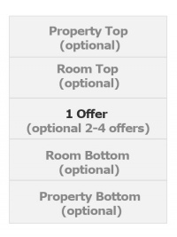
The responsive booking page consists of:
Sections "Offer" contains the standard offer for a room or unit.
- One offer will always be shown
- Additional offers (for example for alternative non refundable prices or packages) are optional
- All other sections are optional.
Modules
Modules define which content is displayed. For each section you can choose from a set of modules.
Rows
1. Choose Modules
Item 1view large
Position: Modules are placed in rows. Each section can have one or more rows.
Width on desktop and mobile: Each row which consists of 12 columns. The number of columns defines the width of the module.
 view large
2. Manage Content
Click on "Manage" to adjust the settings or content of a module.
6 Colors and Fonts
To customise colors and fonts go to SETTINGS->BOOKING PAGE->PAGE DESIGN->STYLE
7 Behaviour
Changes on how the booking page opens and closes can be made in SETTINGS->BOOKING PAGE->PAGE DESIGN->BEHAVIOUR
8 Content
Additional messages can be added to the booking page in SETTINGS->BOOKING PAGE->PAGE DESIGN->CONTENT. This is also where you can change the default warning messages which show when a room is not available.
9 Developers
Advanced functions are available in SETTINGS->BOOKING PAGE->DEVELOPER
- If you are comfortable working with CSS you can apply your own styles
- Add scripts e.g. for Google Analytics
- Exchange any fixed text on the booking page
Here you can find more developer options.

