Responsive Booking Page: Difference between revisions
No edit summary |
|||
| Line 135: | Line 135: | ||
Position: Modules are placed in rows. Each section can have one or more rows. | Position: Modules are placed in rows. Each section can have one or more rows. | ||
Width on desktop and mobile: Each row | Width on desktop and mobile: Each row consists of 12 columns. The number of columns defines the width of the module. | ||
[[Image:row.png|600px|link=]] | [[Image:row.png|600px|link=]] | ||
Revision as of 18:30, 2 April 2018
This page explains how to use and customise the responsive version of the booking page.
Add booking widget to your web site
In SETTINGS->BOOKING PAGE->BOOKING WIDGETS you can choose from a range of widgets
Go to SETTINGS->BOOKING PAGE->BOOKING WIDGETS->IFRAME to generate the code to embed the booking page into your web site. Use the context help (?icons) for information about the iFrame settings.
Set up and customise responsive booking page
Concept
The design of the responsive booking page is modular allowing you to fully control the layout.
Modules
Modules can be added an removed. They have advanced settings so you can tailor the display exactly to your needs. For most modules content needs to be added so they can display. Available modules are:
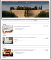
- Picture slider or gallery for property, rooms and offers
- Picture for property, rooms and offers
- Featues for property and rooms
- Availability calendar (one or multiple month) for for property, rooms and offers
- Pricetable for offers
- Descriptions for property, rooms and offers
- Policies
- Map
Templates
We provide a set of default templates with preset modules. You can use these templates as they are or customise them to suit your requirements.
The current default template is 7.
-
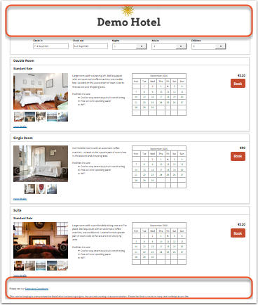
Template 1
Modules:
Offer: Picture Slider, Description 1 , Calendar, Booking Offer Select (Button/Selector)
Property Bottom: Description 2 -
Template 2
Modules:
Property Top: Picture Slider
Offer: Offer Select (Button/Selector), Price Table
Property Bottom: Description 2 -
Template 3
Modules:
Room: Picture Slider, Description
Offer: Price Table, Offer Select (Button/Selector), Picture Slider, Description 2
Property Bottom: Description 2


-
Templage 4
Modules:
Room Top: Picture Slider
Offer: Picture, Description 1 , Calendar, Offer Select (Button/Selector), Description 2
Property Bottom: Description 2 -
Template 5
Modules:
Property Top: Picture Slider
Offer: Price Calendar, Offer Select (Button/Selector)
Property Bottom: Description 2 -
Template 6
Modules:
Property Top: Description 1
Offer: Offer Select (Button/Selector), Price Table
Room Bottom: Picture Slider, Description


Layouts
You can use up to six differnt layouts a the same time if you want to display different looks on different web sites or blogs.
The facebook app uses the "default" layout.
Pictures
To upload pictures and assign them to modules go to SETTINGS->BOOKING PAGE->PICTURES. Assign them to the property, room or offer where you want to use them.
Customise booking page
Go to SETTINGS->BOOKING PAGE->PAGE DESIGN->LAYOUT and click on "Manage" for the layout you want to change and click on "Customise"
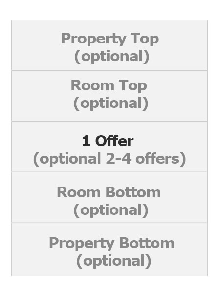
Choose modules and position them
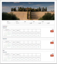
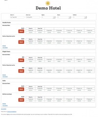
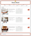
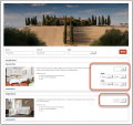
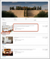
The responsive booking page consists of sections: "Offer" contains the standard offer for a room or unit.
- One offer will always be shown
- Additional offers (for example for alternative non refundable prices or packages) are optional
- All other sections are optional.
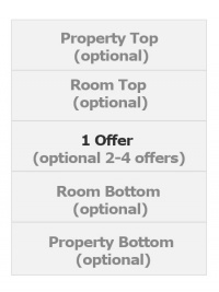
For each section you can choose from a set of modules.
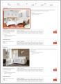
This demo gives you an overview on the mayor modules.
Every module has additional settings which allow you to tailer the disply to your requirement. They are available when you click on "Manage".
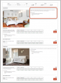
Property modules
-
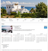
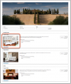
Property Slider
view large -
Property Description
view large -
Policies
view large -
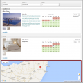
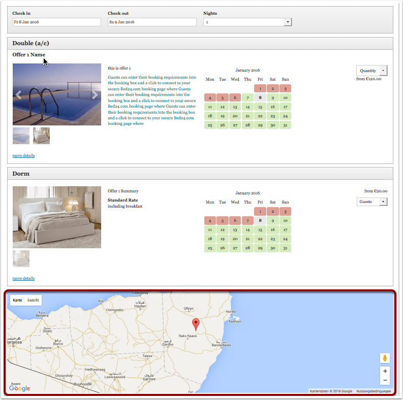
Map
view large -
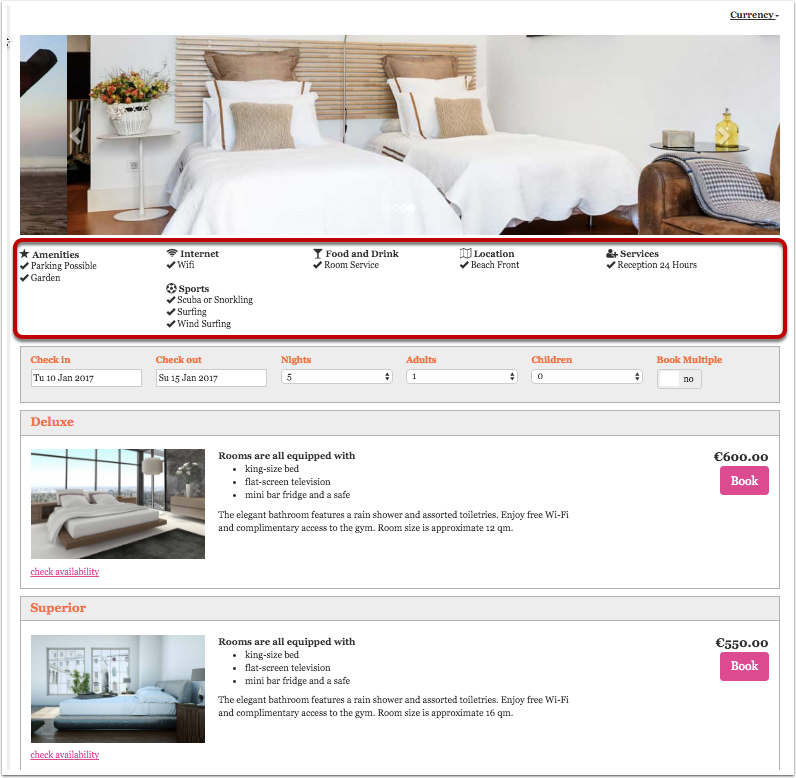
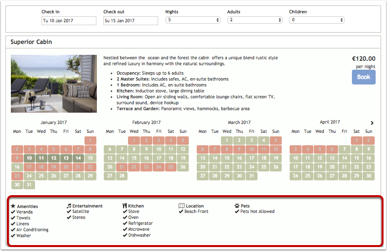
Features
view large


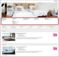
- If you use the property slider or property picture and have "Style" set to "Full width" you will need to make sure the slider/pictures position is set to row 1 position 1, desktop full widht and mobile full width. There should be no other module in row 1. Also make sure you deactivate all modules which you do not use.
- The map uses the coordinates entered in SETTINGS->PROPERTY->DESCRIPTION. If necessary, a maps API key can be entered at SETTINGS->BOOKING PAGE->DEVELOPER
- Features can be added in SETTINGS->PROPERTIES->DESCRIPTION.
- Policies display the information entered in SETTINGS->PROPERTY->DESCRIPTION. A link to policies on your web site can be please wherever you can enter descriptive texts. You can set up a "custom question" (Type= Checkbox, Use=Obligatory) in SETTINGS->PROPERTIES->-BOOKING QUESTIONS. If required you can add a link for example: "I accept the <a href="http://www.mywebsite.de/agb" target="_blank">terms and conditions </a>." Replace www.mywebsite.de/agb with a link to the terms and conditions on your web site.
Room modules
-
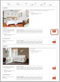
Room Slider
view large -

Room Picture
view large -
Room Description
view large -
Features
view large


- Features can be added in SETTINGS->PROPERTIES->ROOMS-> SETUP.
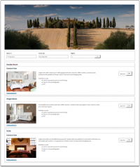
Offer modules
-
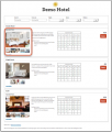
Offer Slider
view large -
Offer Picture
view large -
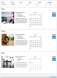
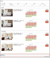
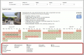
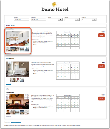
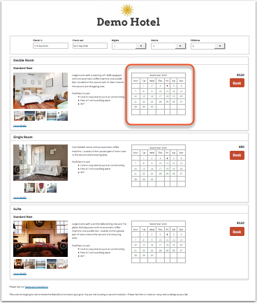
Offer Calendar
view large -

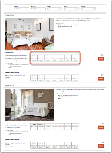
Price Table
prices will only display if booking of multiple rooms is not allowed
view large -
Price Calendar
prices will only display if booking of multiple rooms is not allowed
view large -
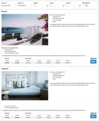
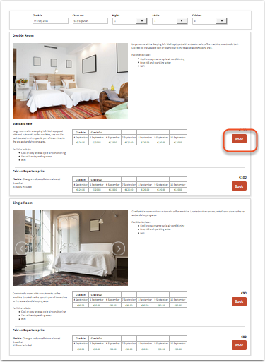
Offer Select
one room
view large -
Offer Select
multi room booking
view large -
Offer Description
view large


Note: Offer Calendars and Price Calendars can not be used in the same layout. If you have multiple offers the calendar will show the same availability for all offers.
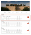
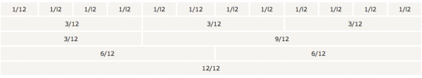
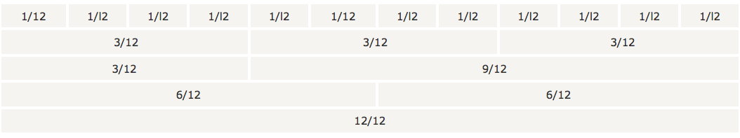
Position: Modules are placed in rows. Each section can have one or more rows.
Width on desktop and mobile: Each row consists of 12 columns. The number of columns defines the width of the module.
All "Description" Modules allow to enter text or html content.
Click on "Manage" to customise the settings of a module. All modules can be set to always display or to be available via a link.
If you have activated one or more of these modules:
- Room Description 1 go to SETTINGS->PROPERTIES->ROOMS>SETUP to enter the content for the modules.
- Offer Description 1 go to SETTINGS->PROPERTIES->OFFERS to enter the content for the modules.
- Offer Description 2 go to SETTINGS->PROPERTIES->OFFERS to enter the content for the modules.
- Marketing Column. The Marketing Column displays only in the modules "Price Table" and "Price Calendar". Go to SETTINGS->PROPERTIES->OFFERS to enter the content for the modules.
Go to SETTINGS->BOOKING PAGE->PAGE DESIGN->CONTENT to enter the content for the modules.
If you have activated one or more of these modules:
- Property Description 1
- Property Description 2
- Property Description - Booking Page 1
- Property Description - Booking Page 2
Go to SETTINGS->BOOKING PAGE->PAGE DESIGN->CONTENT and enter the content of the module
You can save your changes to this layout or under a different layout. The "Restore Default" option will remove all changes.
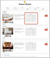
Colors and fonts
To customise colors and fonts go to SETTINGS->BOOKING PAGE->PAGE DESIGN->STYLE
Current default setting are:
| Setting | Value |
| Body Background | #f4f4f4 |
| Content Background | #f4f4f4 |
| Content Text | #424242 |
| Link Color | #008acc |
| Border Color | #4dfdfdf |
| Highlight Background From | #ffffff |
| Highlight Background To | #ffffff |
| Highlight Text | #424242 |
| Form Background | #ffffff |
| Form Text | #424242 |
| Selected Dates Background | none |
| Selected DatesText | #222222 |
| Available Dates Background | #f2f2f2 |
| Available Dates Text | #424242 |
| Request Dates Background | #dddddd |
| Request Dates Text | #777777 |
| Not Available Dates Background | #f2dede |
| Not Available Dates Text | #a94442 |
| Button Style | flat |
| Button Background | #008acc |
| Button Text | #ffffff |
| Font | Arial (Helvetica) |
| Font Size | 14px |
Behaviour
Changes on how the booking page opens and closes can be made in SETTINGS->BOOKING PAGE->PAGE DESIGN->BEHAVIOUR
Internationalisation
Currency converter
If you want to give guests the option to see your prices converted into other currencies you can activate a currency converter. Add for example &cur=EUR or &cur=USD to the URL to open the page with the conversion. If you are using Wordpress with a short code add cur=EUR or cur=USD to the short code. Go here for a complete list of currency codes.
Multiple languages
You can set your default language and activate multiple languages. Make sure you enter descriptive texts for all languages you want to use. If you are using an embedded booking page on a multilingual web site you can embed you booking page with a different default language for each language version. Click here for instructions.
Additional options
General settings which apply to all layouts like minimum/maximum number of guests, nights, type of price display etc. are in SETTINGS->BOOKING PAGE->PAGE DESIGN.
Multiple or single room booking
You can allow guests to book one room or unit, multiple rooms or units of give the the choice. The setting is available in SETTINGS->BOOKING PAGE->PAGE DESIGN.
Allow enquiries when no price is found
If you are using rates you can set "Allow Enquiry" = yes. This will allow the guest to send an enquiry if you have availability but the system can not find a price. If you generally want to accept only "Requests" instead of confirmed bookings go to SETTINGS->PROPERTIES->RULES and set your "Booking Type" = Request
Add a logo to your page
- Go to SETTINGS->BOOKING PAGE-> PICTURES and choose your file and import.
- Scroll to the picture and click 'Manage', scroll to the bottom of the page and copy the URL.
- Go to SETTINGS->BOOKING PAGE->PAGE DESIGN->CONTENT->Property Description 1
- Click 'Edit', then find the 'Image' icon and paste the url into the URL box and add a description if necessary, resize as required, click OK. Use the other features to position the image as you required (centre, left, right).
- Click Save.
Additional messages and warnings
Additional messages can be added to the booking page in SETTINGS->BOOKING PAGE->PAGE DESIGN->CONTENT. This is also where you can change the default warning messages which show when a room is not available.
Add a TripAdvisor review widget
Tripadvisor provides a code snippet for reviews.
1. Copy the widget code from your TripAdvisor account.
2. Add the code to your booking page
You can add the code snippet into and editable field on the booking page. Click on "Edit" then in the editor on "Source" to insert the code into your booking pages source code.
Make sure the module which you want to use is activated.
Use multiple layouts
If you want to use multiple layouts you can add a layout parameter to the URL. Example:
https://www.beds24.com/booking2.php?propid=13437&layout=2
will display layout 2. If you are using Wordpress you can add a layout parameter to the shortcode as explained in the plugin settings.
The Facebook app will display the default layout.
Developer options
Advanced functions are available in SETTINGS->BOOKING PAGE->DEVELOPER
- If you are comfortable working with CSS you can apply your own styles
- Add scripts e.g. for Google Analytics
- Exchange any fixed text on the booking page
Stripe and Paymill insert their button and can not be changed. To change the text of any of the other payment buttons you can place this code snippet into SETTINGS -> DEVELOPERS -> "Advanced HTML Settings".
Custom Instruction:
<script type="text/javascript">
$(document).ready(function() { $("#buttoncustominstruction").val("the new text"); });
</script>
Authorize.Net:
<script type="text/javascript">
$(document).ready(function() { $("#buttonauthorizenet").val("the new text"); });
</script>
Paypal
<script type="text/javascript">
$(document).ready(function() { $("#buttonpaypal").val("the new text"); });
</script>
Here you can find more developer options.
Multiple properties
If you have multiple properties you can use the multiple property booking page to displays all properties in your account. It links to the property booking page where the actual booking is made.
Change from adaptive to responsive booking page
Go to SETTINGS->BOOKING PAGE and select "Booking Page Version" = Responsive. This setting will activate Layout 1.
When you change from adaptive to responsive you need to assign your pictures again. Go to SETTINGS->BOOKING PAGE->PICTURES. Set the selector to the room then choose "Offer 1" and activate the picture/pictures you want to display. If you are using more than one offer repeat for each.
NOTE: If you select "Booking Page Version" = Responsive your live web site will change to the new design. If you just want to have a look you can do this adding &version=3 to the URL of your booking page. To see the different layouts also add the layout number eg. &version=3&layout=2 will show you layout 2. Alternatively you can copy your property and use the copy for testing. If you do this make sure all channel manager connections are deactivated in the copy property. The normal monthly fee will apply for additional rooms so you might want to reduce the number of rooms in the copy property. When you are finished with the customisation you can use the "Clone Property" function in SUBACCOUNTS (top right menu) to apply the changes to your real property.